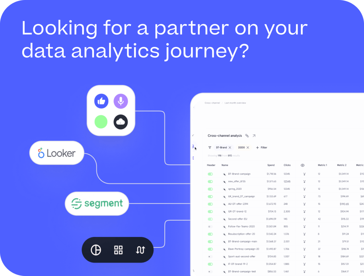
Building a Mobile-Friendly KPI Dashboard using Looker Studio Integration with Looker Universal Semantic Model — Rittman Analytics
One of the new features added into Looker in the past year is integration with Looker Studio, the new name for Google Data Studio, along with similar integration with Google Sheets.
Users of Looker Studio can now build reports using governed metrics and dimensions from their Looker semantic model while Looker developers now have access to a much richer and flexible reporting tool should they want to go beyond standard Looker dashboards.
Google Cloud Platform recently announced BI Connector integration for ThoughtSpot and Sisu to go with the previously-announced Tableau, together with a new forthcoming tool called Looker Modeler that enables LookML development of what’s now termed the Looker Universal Semantic Model independent of the Looker web IDE.
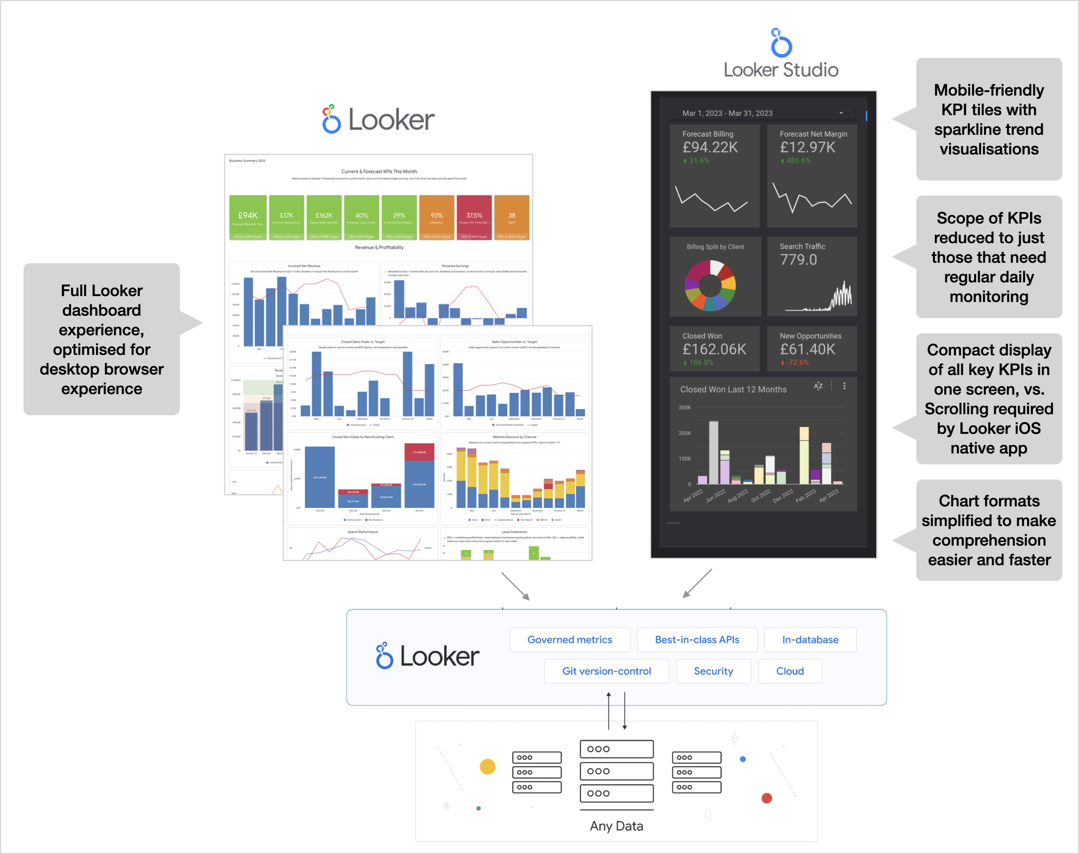
For now though, one way that we’ve used this new integration at Rittman Analytics is to create a mobile-friendly web app KPI dashboard to accompany our main Looker KPI dashboard, showing in a compact and mobile-friendly format the most important business metrics for our management team and based-on the same “single version of the truth” as the main dashboard.
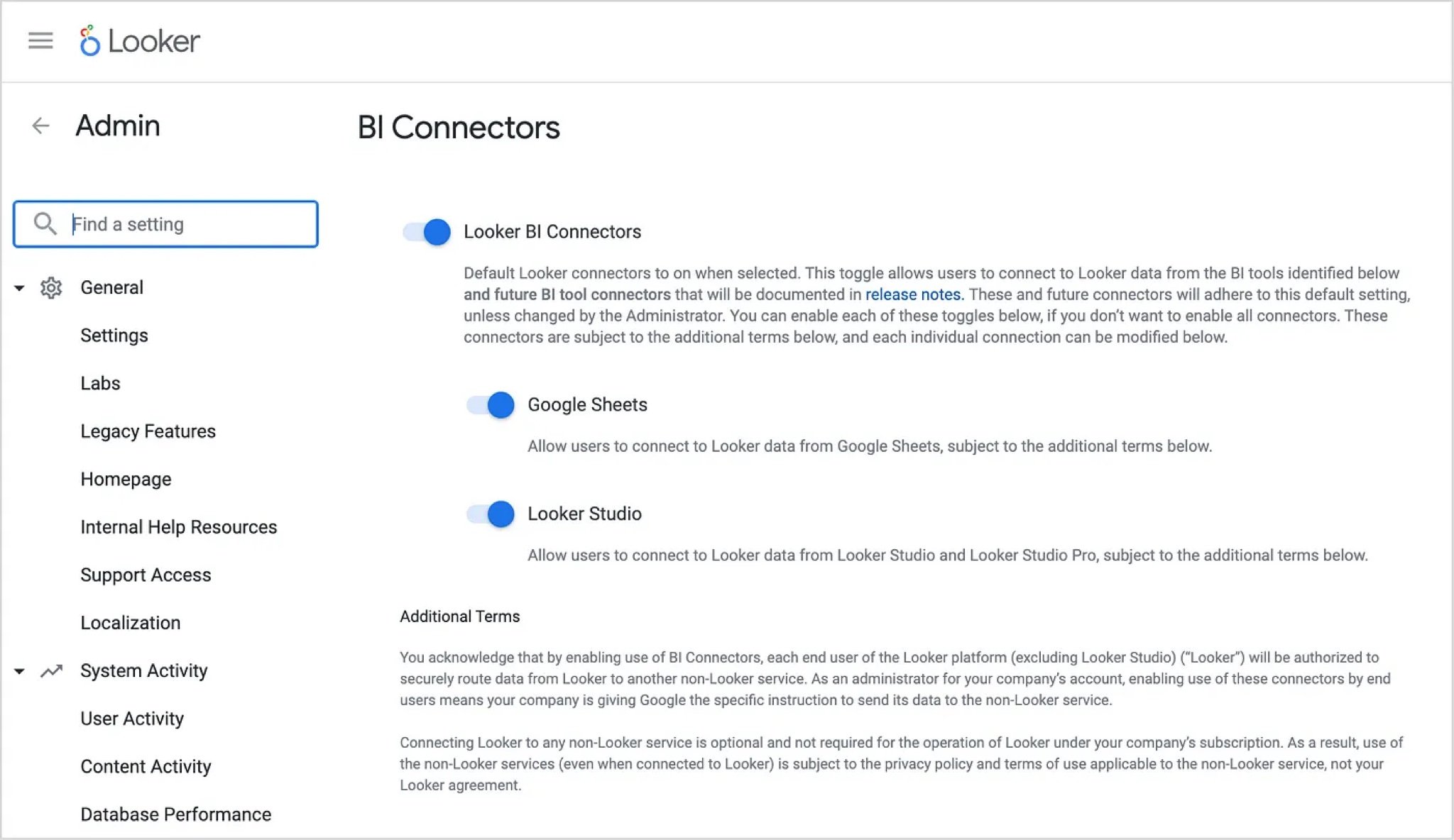
A pre-requisite for connecting Looker Studio to your Looker account is to first enable the BI Connectors feature within Looker’s Admin menu.
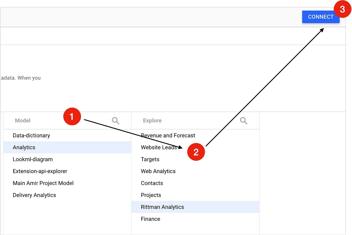
Now, assuming that you’ve got an explore set-up within Looker that you want to use as your Looker Studio data source, use your web browser to navigate to the Looker Studio Data Sources page.
From there, click the Create button and select Looker as the data source type, then enter the domain name for your Looker account and finally the Connect Looker Account button to authorise and create your connection.
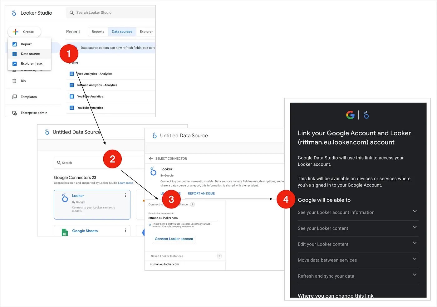
You should now see a list of models that your Looker account makes available. Select the model, and then the explore within that model that contains the data you are looking for, and then press the Connect button.
Note that, similar to the Merge Query feature within Looker’s explore user interface, later on we can merge in additional Looker data sources into our report as well as data sourced from any of the other official and community supported data sources available for Looker Studio.
If you’re familiar with the Data Studio report creation process you’ll recognise the page where all of the dimensions and measure columns from your data source are presented and available to hide, format or add more derived columns for.
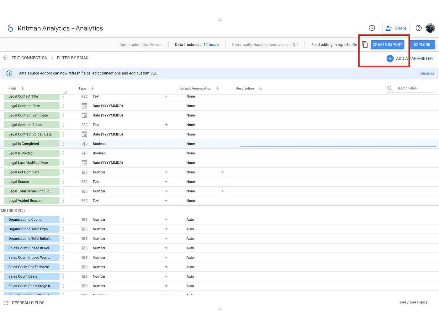
In the case of Looker-sourced measures you don’t need to set their aggregation method, just leave them as Number as the LookML definition of those measures’ aggregation type will automatically be used when displayed in a report; just press Create Report to start creating your report layout.
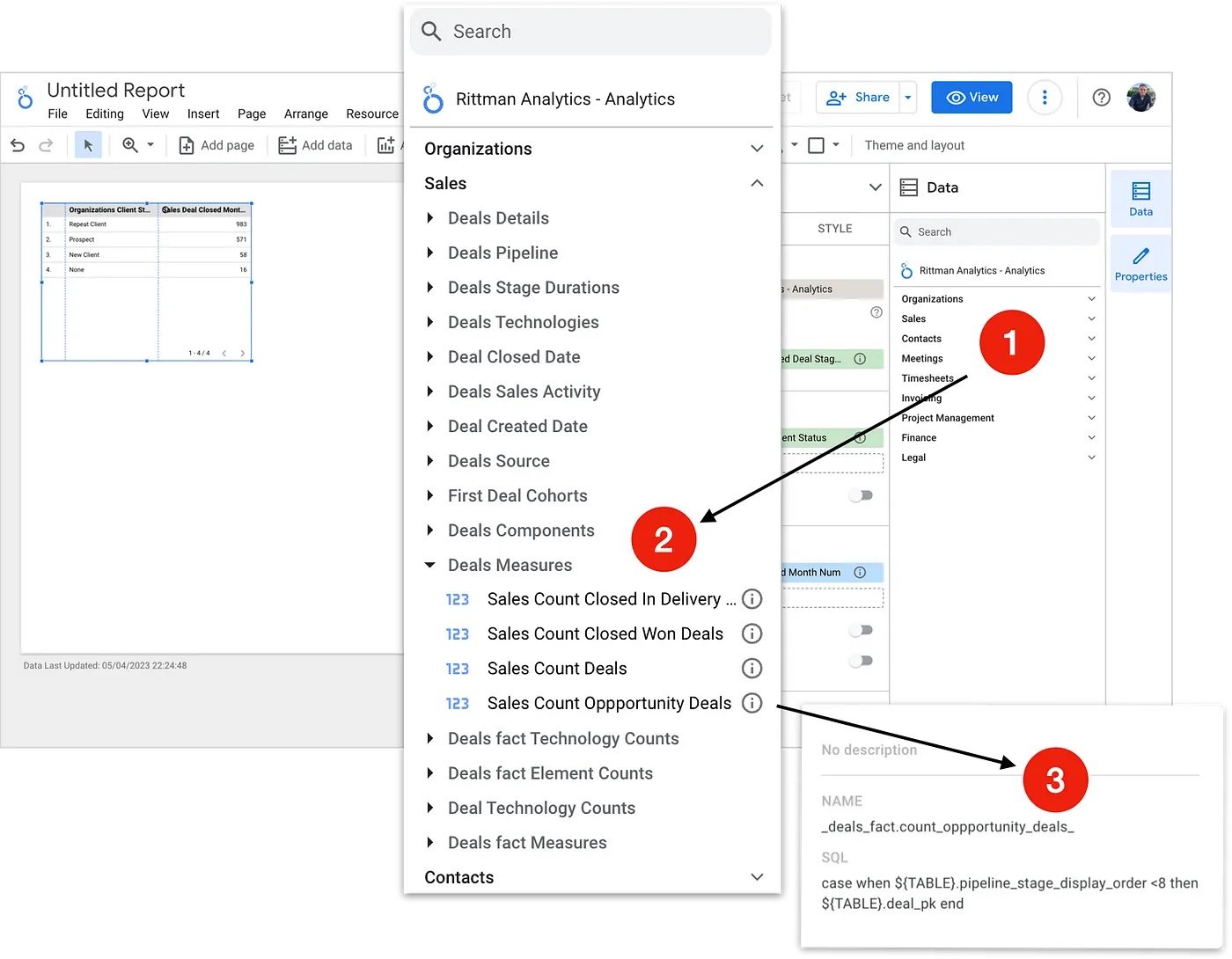
Creating a Looker Studio report with Looker as the data source adds a folder-style grouping of the views, dimensions and measures in your chosen explore, and you can even click on the information icon to see the LookML definition for each of the explore items.
To make my Looker Studio report work as a web app-style mobile dashboard I then make the following configuration changes to a standard report template:
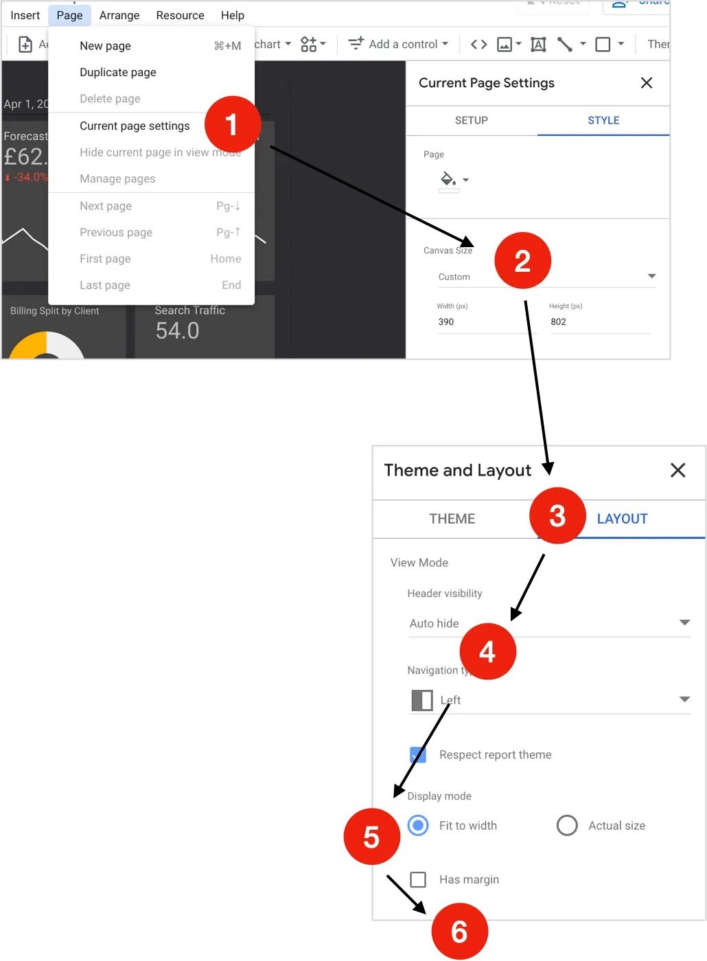
Select Page > Current page settings
Set the Canvas Size to 390 (px) Width and 802 (px) Height, the typical viewport screen area for a modern iPhone.
Now press the Theme and Layout button in the report header menu and select Auto hide as the Header visibility setting.
Set the Display Mode to Fit to width
Finally, uncheck the Has margin checkbox
Now the report template is all set to be mobile-friendly and formatted correctly, I then create my mobile KPI dashboard using dark mode colours, sparkline charts and stripped-back bar charts and KPI tiles that call-out our most important performance metrics.
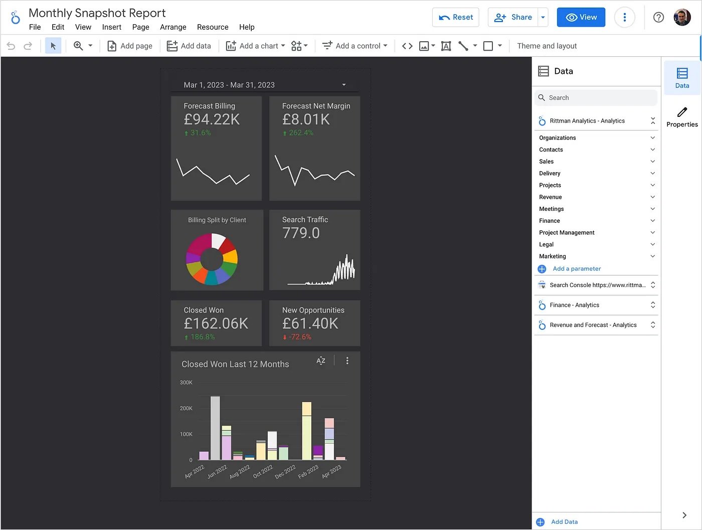
Notice the three additional data sources that were added to the final report to create the final mobile KPI dashboard shown in the screenshot above; two more Looker explores that contained the Net Margin and Forecast Billing KPIs, and the Google Search Console data source for the Search Traffic KPI.
Using Looker Studio data source connectors to blend-in data from marketing, advertising and SaaS data sources is a useful lightweight alternative to using tools such as Fivetran and dbt to extract and then integrate those data sources into your warehouse.
The downside is that any integration of those data sources is specific to just that one report, but if all you want to do is display your ad spend data alongside other marketing metrics then this approach gets the job done without requiring IT support and the more complete integration I blogged-about a few posts ago.
INTERESTED? FIND OUT MORE
Rittman Analytics is a boutique analytics consultancy specializing in the modern data stack who can help you centralise your data sources, optimize your marketing activity and enable your end-users and data team with best practices and a modern analytics workflow.
If you’re looking for some help and assistance analyzing and understanding your customer behaviour, or to help build-out your analytics capabilities and data team using a modern, flexible and modular data stack, contact us now to organize a 100%-free, no-obligation call — we’d love to hear from you!
Recommended Posts
Google Integrates Spectacles into Looker for Continuous Integration & Regression Testing
Adventures in Aggregate Awareness (and Level-Specific Measures) with Looker
IQR-Based Website Event Anomaly Detection using Looker and Google BigQuery — Rittman Analytics